Building a Web Grid - Part 2
Update: Last night I added a new example for grijq that demonstrates the different options available for the grijq widget. You can find it at All the options.
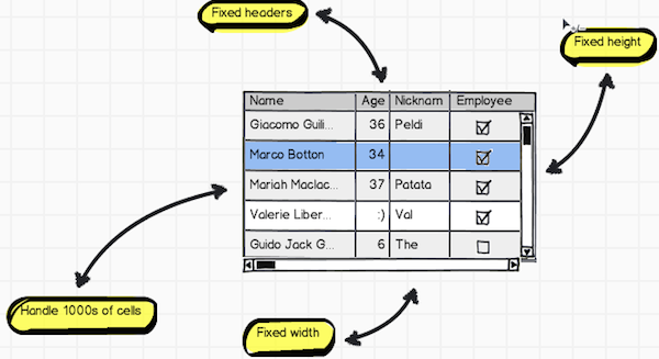
Mr. Browser, will you help me find my puppy?
I attacked the problem of scrolling head on in the same way that the jQuery
plugin Table Fixed Header works: break the
table into two tables, one containing the header and one containing the body.
Put those into their own divs with the body table’s set to
overflow: scroll and you got most of the way there. Finally, subscribe to
the body table’s div’s horizontal scroll event and move the absolutely
positioned header table by that amount to the left or right. In steps.
Starting with this table…
1 | <table id="original-table"> |
…I break it into two tables with identical colgroups…
1 | <!-- Header table --> |
…wrap it in divs with scrolling and positioning…
1 | <!-- Header table --> |
..and, finally, subscribe to scrolling events to align header columns with body columns.
1 | $(function() { |
And, this works great! The demonstration that I gave showing my 1000-entry table used this method and it performed well. The perfectionist in me, though, had a bee in his bonnet because of all that DOM playing. I wanted something different. I went looking for it.
Mr. Browser, will you help me find my unicorn pony pegasus?
What I really want, in my dream solution, the solution I really want would not
have that extra table in it. For goodness sake, the DOM contains a distinct
element that holds the header, the thead; can’t I just find a way to style
the crap out of that?
Well, someone else found it. I just made it better.
CSS Scrolling Tables with Fixed Headings
over at the CSS Bakery contains a killer write-up on just that. However, the
final solution
displays a fixed-width table that uses style sheets to determine the widths of
the columns. While that works for her example, I need a table that uses
colgroups. (The importance of this appears in tomorrow’s post about column
resizing.)
In her recipe, we need two divs to wrap the table for positioning the table
and provide scrolling. That’s what I worked with and, by default, my table
does not have a fixed width. Instead, it expands to fill the available space,
like a good data grid would do. The grijq widget creates those two nested
divs with appropriate style classes, and wraps the original table with them.
I apply the jQuery UI CSS framework styles, as well.
1 | <div class="ui-grijq"> |
If the programmer specifies a height or width, I set them on the
.ui-grij-scroll and ui-grij divs, respectively.
Because I want the table to comply with the actual specified widths in the
colgroup, I have to specify table-layout: fixed in the style sheet for the
class that I apply to the table. I also collapse the borders so I know the
number of pixels added to the layout.
1 | .ui-grijq { |
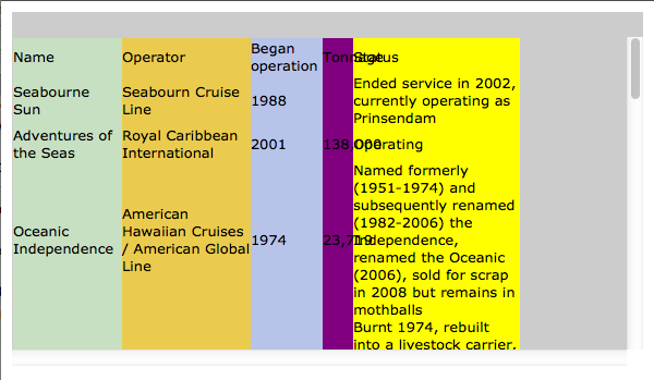
To prevent the text from pushing the width of the columns beyond the specified
width, I specify white-space: nowrap on all of the td and th tags. I
also apply overflow: hidden; to the divs inside each of the cells. This
allows the columns to truly align on the specified widths.
1 | .ui-grijq .ui-grijq-scroll .ui-widget td, |
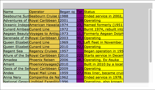
Now, to get the thead to stay in place, I apply position: absolute; to it.
And, that ruins the widths of the cells in the header; they collapse to the
minimum width needed to display their text. So, as part of the initialization
of the grijq, I specifically apply inline widths to each of the th tags.
This gets everything back in order.
1 | .ui-grijq .ui-grijq-scroll .ui-widget thead { |
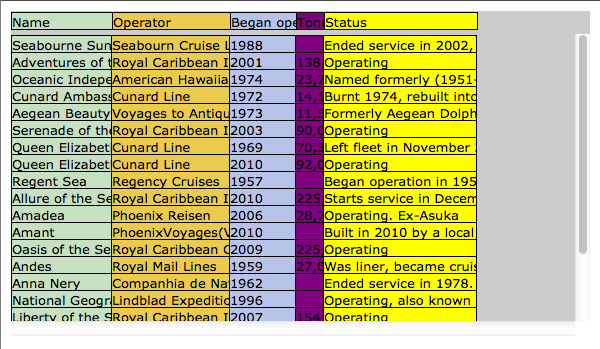
Next, I add padding to the cells to make them easier to read.
1 | table.cruises th div { |
And, the irrational roars!
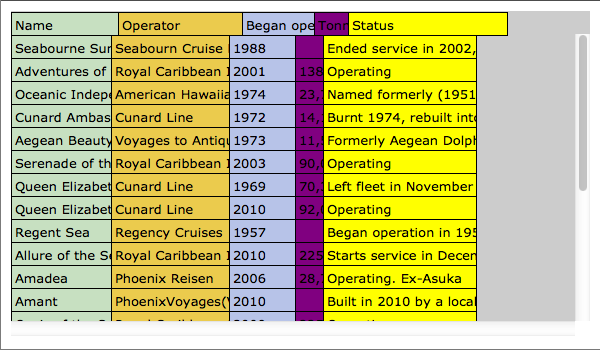
It seems that the absolutely positioned cells in the header add their specified width and the amount of left and right padding to determine their final layout. The normal table cells do not include the left and right padding in their outer width determination. This makes no sense to me; however, every browser that I tested had the same behavior. I apply inline the difference of the specified width and the sum of the left and right padding to the header cells.
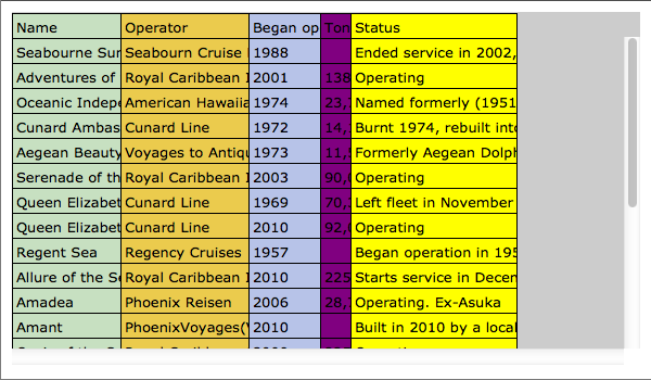
Finally, I need the horizontal scrolling to affect the absolutely positioned
thead. Just like in the solution presented previously, I subscribe to the
scroll event to modify the left value.
This allows me to maintain a much cleaner DOM. Less DOM manipulation means less time for the widget to initialize. I like that.
Next…
Tomorrow’s entry will address the column resizing. I don’t think that you’ll find anything too crazy in that entry. It does show the ease with which you can do cool things with a little jQuery and a modern browser.